Deschutes
NEW BRAND LAUNCH / PACKAGING / RETAIL
As a 30-year-old “founding father” of American craft beer, Deschutes Brewery saw itself falling behind the times. Consumer research indicated a perception of Deschutes as a “dad beer”—less relevant than a wave of upstart craft competitors. Additionally, the brand was one of the last craft brews not available in cans. A one-time pioneer in the craft category, known for iconic labels illustrated with scenes of its hometown of Bend, Oregon, Deschutes suddenly found itself behind the trends with static sales. Brave with all of our "Can-Do attitude" hopped right into the process to strategicially help turn things back on for Deschutes.
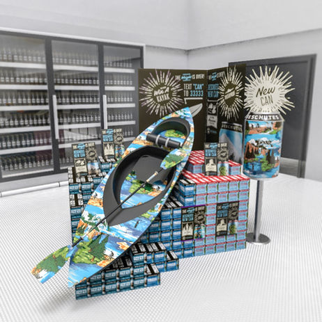
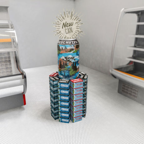
Our collaboration with Deschutes began a retail-strategy initiative to help the brand regain competitive floor space and regain attention in the shopping aisles, and evolved to lead the design and launch implications of Deschutes’ commitment to cans. Partnered with their lead branding and design firm, we concepted "The weight is over.” Setting the tone by poking fun at the brand’s late adoption of cans, the theme also highlighted the primary benefit of cans being lighter and easier to transport than bottles. We then developed launch strategies that demonstrated all the places, ways and activities in which Deschutes could be better enjoyed in a can.
The cans allowed for new on-floor placement opportunities that put Deschutes at the forefront of consumers’ minds in a modern and visually-engaging way. Within a six-month period, post launch, the rate of depletion of cans increased by more than 5%, and is still trending upward. The packaging, combined with pushing “The weight is over” on social media, has garnered more than 11MM impressions to date


